Lumina Clinic

Redesigning a medical spa's website.

Role

Duration

Tools

Web/UX/UI Designer

Feb '25 - Mar '25

Figma, Wordpress

Lumina Mockup

The Project

Lumina is a wellness clinic blending expertise in vascular health with advanced skin and health treatments. The clinic required a seamless platform for discovering and booking treatments, and providing comprehensive information about the medical devices it uses.

The primary goal of the project was to create a modern, user-friendly website that highlights Lumina’s expertise and client-focused approach.

Objectives

01.

Improve UX/UI

  • Enhance customer journey
  • Create intuitive navigation
  • Simplify steps to book services
  • Ensure scalable design for different devices
02.

Align goals & constraints

  • Increase conversions
  • Account for various user demographics
  • Consider technical constraints of a CMS and third-party applications
  • Stay within accessibility guidelines (WCAG 2.2)
03.

Create engaging design

  • Utilize a natural color scheme while maintaining a bright visual style
  • Stay consistent with established branding
  • Foster approachability and a minimal aesthetic

Approach

I identified areas of user friction, inconsistencies, and poor functionality in the current design.

  • The information architecture was poorly laid out, and the user interface lacked balance and visual hierarchy.
  • The third-party booking platform is visually cluttered and inefficient, thus making it important for the website to simplify the booking process as much as possible.
  • Each page of the website contained endless content, producing cognitive overload.

Additionally, I needed to address a customer base between the ages of 20 to 65. With such a wide age range, backgrounds and technical experience would differ significantly. I created a sitemap that focused on breaking up content and making the website easy to navigate, no matter the user. From there I produced wireframes that prioritized a minimal interface, relevant and concise information, and simplified steps to book a service.

Sitemap
Lumina Sitemap
Mid-Fidelity Wireframes
Homepage Wireframe
About Wireframe
Service Wireframes

Process

To enhance the user journey, I streamlined the navigation menu by incorporating dropdowns and sub-pages to organize content and reduce excessive scrolling. I also added card-based navigation to sub-pages, making it easier for users to locate information. For services with advanced medical technology, I implemented accordions to address frequently asked questions, ensuring the page didn’t become overcrowded with text.

To improve accessibility and engagement, CTAs are strategically placed throughout the site so customers can easily access the booking platform. For services with multiple types of treatments, I utilized card-based navigation to directly link users to each treatment’s specific booking page.

CTA Walkthrough Video
CTA Mobile Example
CTA Desktop Example

As part of refining both the visual identity and user experience, I selected a color palette that incorporates neutral tones and earthy browns to reflect natural skin tones and organic hues. All colors were tested for proper contrast and met accessibility standards (WCAG 2.2), ensuring an inclusive experience for all users.

For the typography, I aimed for an approachable and modern look, with a touch of classic elegance. Libre Caslon Display brings a timeless feel, while Proxima Nova offers versatility and excellent readability.

Color Palette
Title

Libre Caslon Display

Body

Proxima Nova

To further strengthen the brand identity, I designed custom icons and buttons that seamlessly integrated into the site's minimal design, adding a personalized yet subtle touch.

Custom Branding

To deliver a seamless experience, the site was designed to be fully responsive on any device. Starting with a mobile-first mindset, I focused on simplicity, readability, and ease of navigation at smaller sizes before scaling up to larger screens.

I designed flexible layouts, scalable typography, and adaptable components, ensuring the site remained intuitive, accessible, and visually balanced from mobile to desktop. This approach ensured the design adapted effortlessly, supporting a minimal and intuitive user journey.

Mobile Mockup
Tablet Mockup
Desktop Mockup

Key Outcomes

The redesigned Lumina website successfully delivers a streamlined, intuitive user experience while reflecting Lumina’s core values of natural beauty, simplicity, and well-being. 
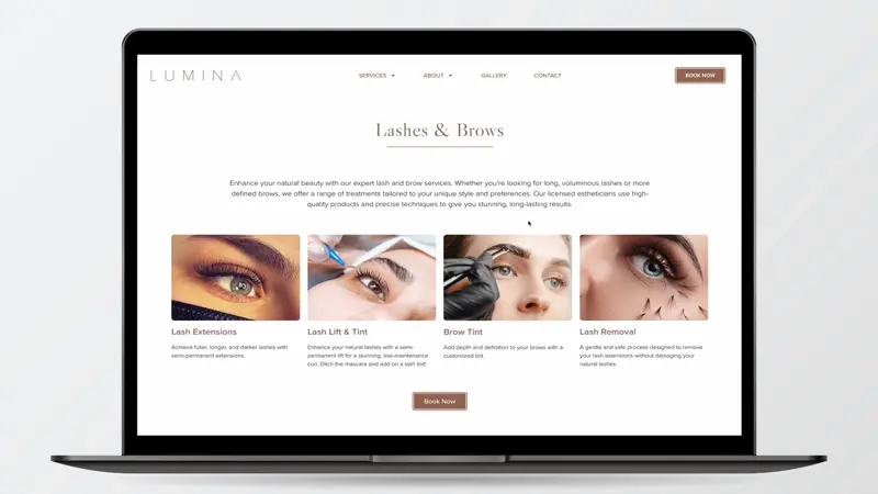
Navigation is clear and efficient, services are easily accessible through card-based layouts and CTAs, and responsive design ensures a seamless experience across devices. Custom design elements, a carefully selected color palette, and accessible typography reinforce a cohesive, minimal aesthetic consistent with the brand. Overall, the new design strengthens Lumina’s digital presence, improves user engagement, and provides a foundation for future growth.

This project was a reminder that thoughtful design goes beyond aesthetics — it’s about creating experiences that reflect a brand’s mission, meet users’ needs, and build meaningful connections.

Homepage Example
Homepage Example