Problem
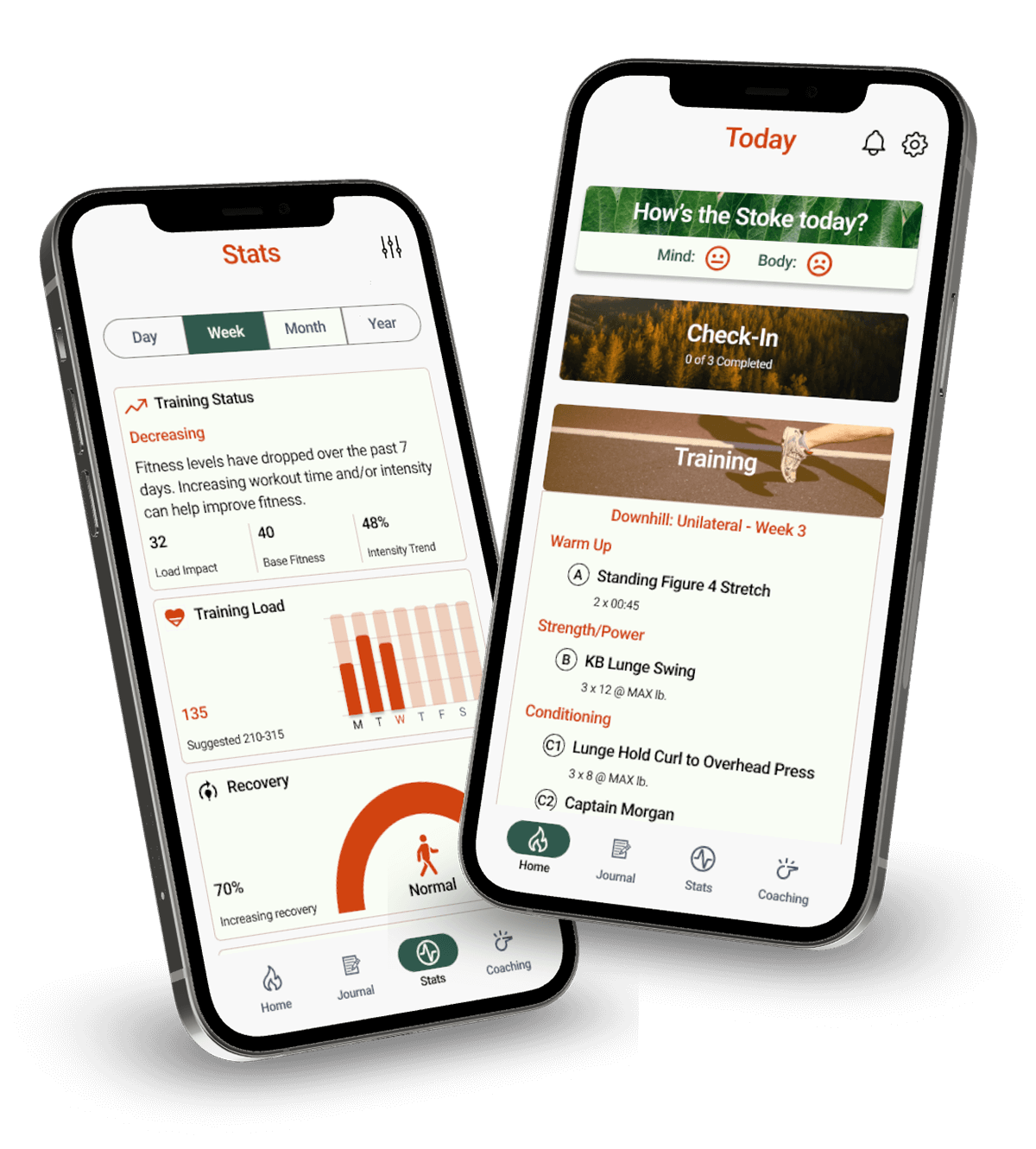
Stoke was created out of a need to make a comprehensive product
that addresses the correlation amongst fitness, nutrition, and
mental health. Competitive analyses proved existing products on
the market as one-sided, too heavily focused on hitting a number
goal, and including data that is either misleading or too
technical. Through initial user research, I learned users are
left confused, overwhelmed, or traumatically triggered, making
it difficult to lead a balanced and healthy lifestyle.
“Fitness and nutrition should add to your life, not be a
negative thing.”
-
The current state of the fitness and nutrition industry is
triggering, especially for those with histories of
disordered eating or body dysmorphia.
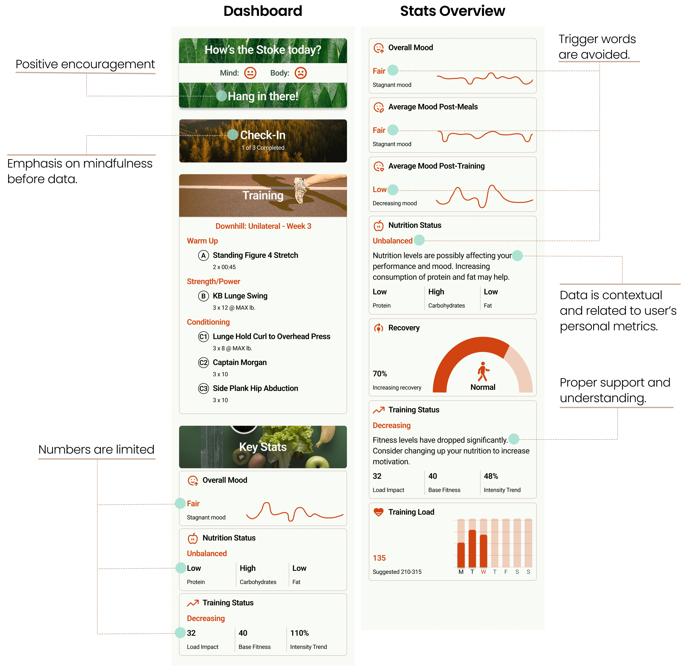
“It would be great for the numbers to happen behind the
scenes.”
-
Users want their data to be more contextual and
educational rather than generically prescribed numbers and
graphs.
“I struggled with that lean body mindset.”
-
Positive encouragement is lacking in current trackers,
which influences users to behave or pick up habits that do
not improve health and wellbeing.
“I think about eating quite a bit, and probably not in a
healthy amount.”
-
A large obstacle surrounding nutrition is proper emotional
support and understanding how to affect stable positive
change.
Design Process
To start, I conducted competitive analyses of similar apps in
the market as well as interviewed target users about their goals
and experiences using these apps. This allowed me to determine
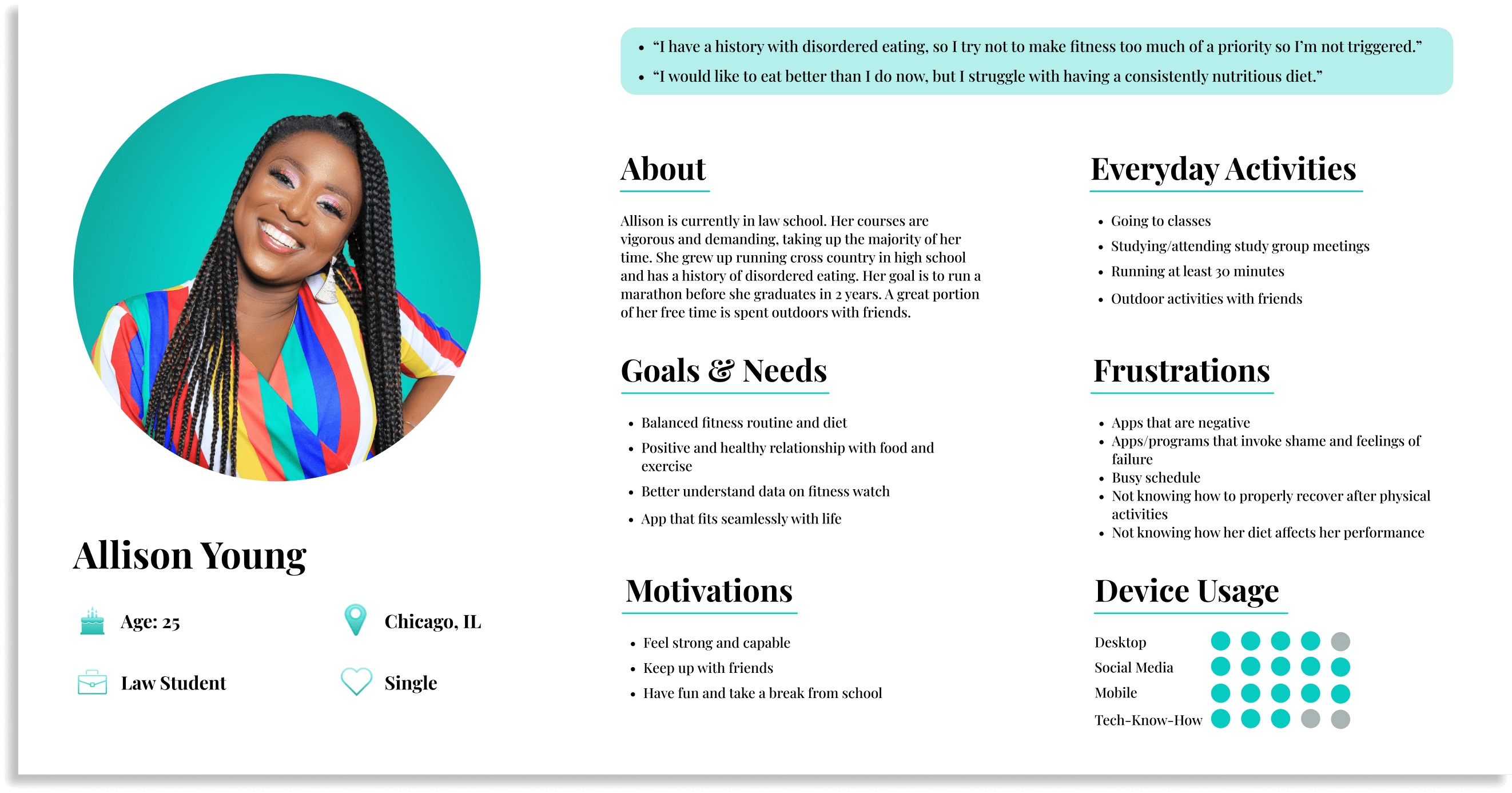
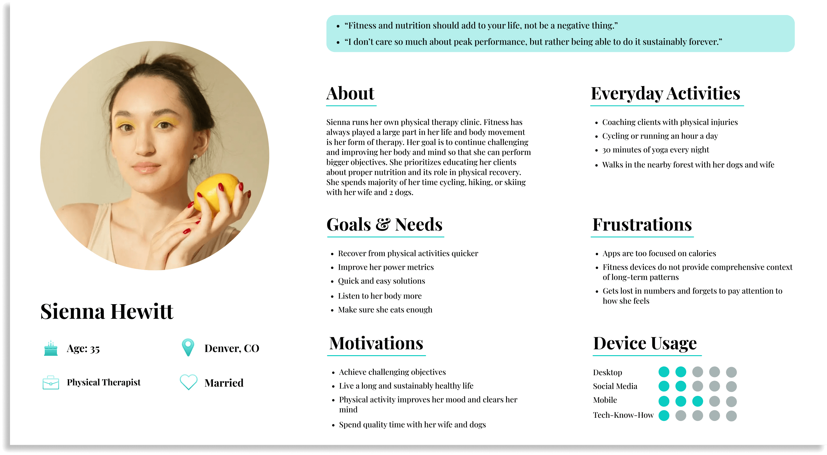
the types of users that would benefit from Stoke. I created two
user personas that reflected individuals with differing goals
and education. While there is the average user who has limited
knowledge of the science behind health, it was important to also
consider users whose backgrounds are deeply rooted in fitness
and nutrition.
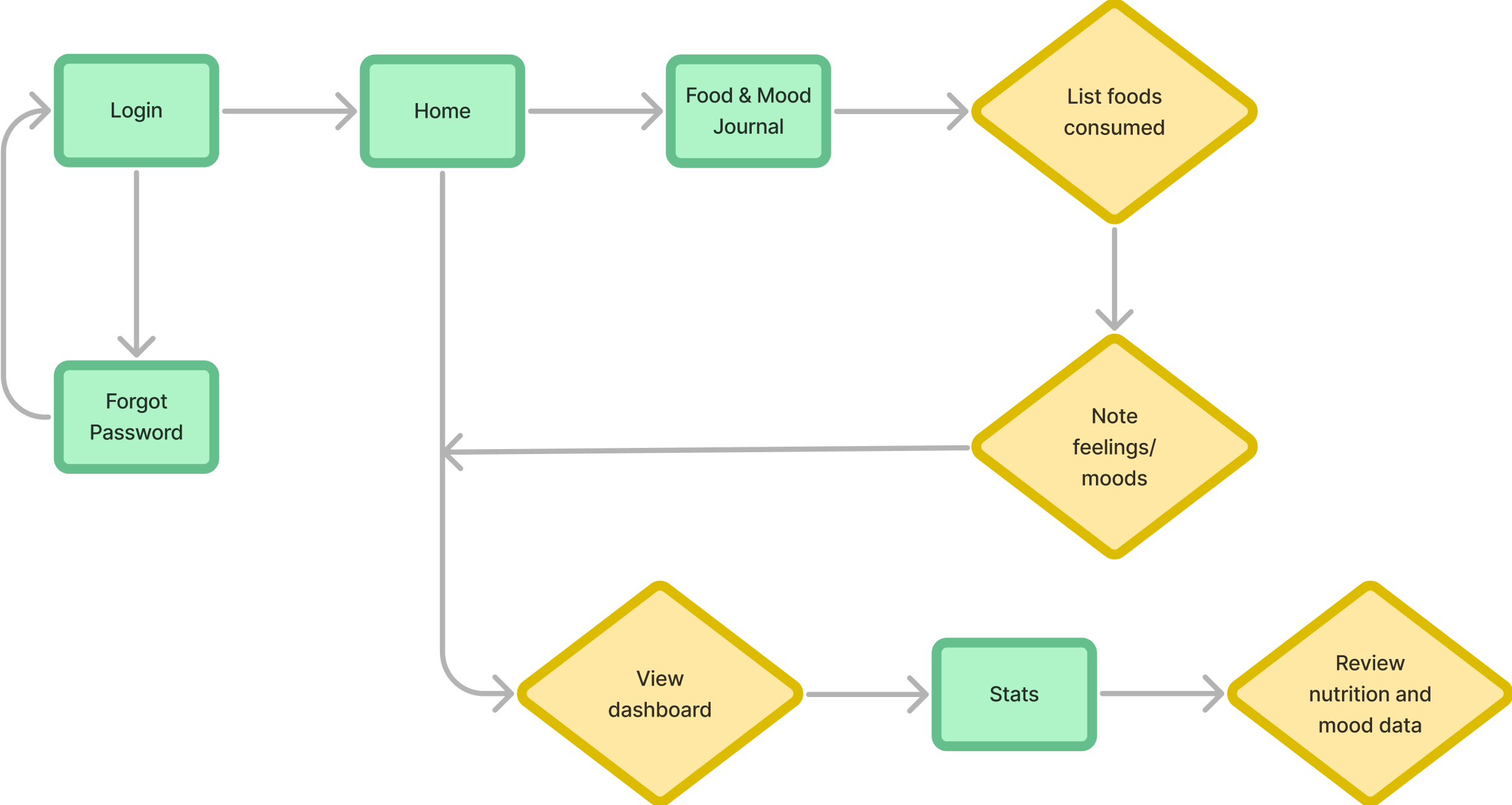
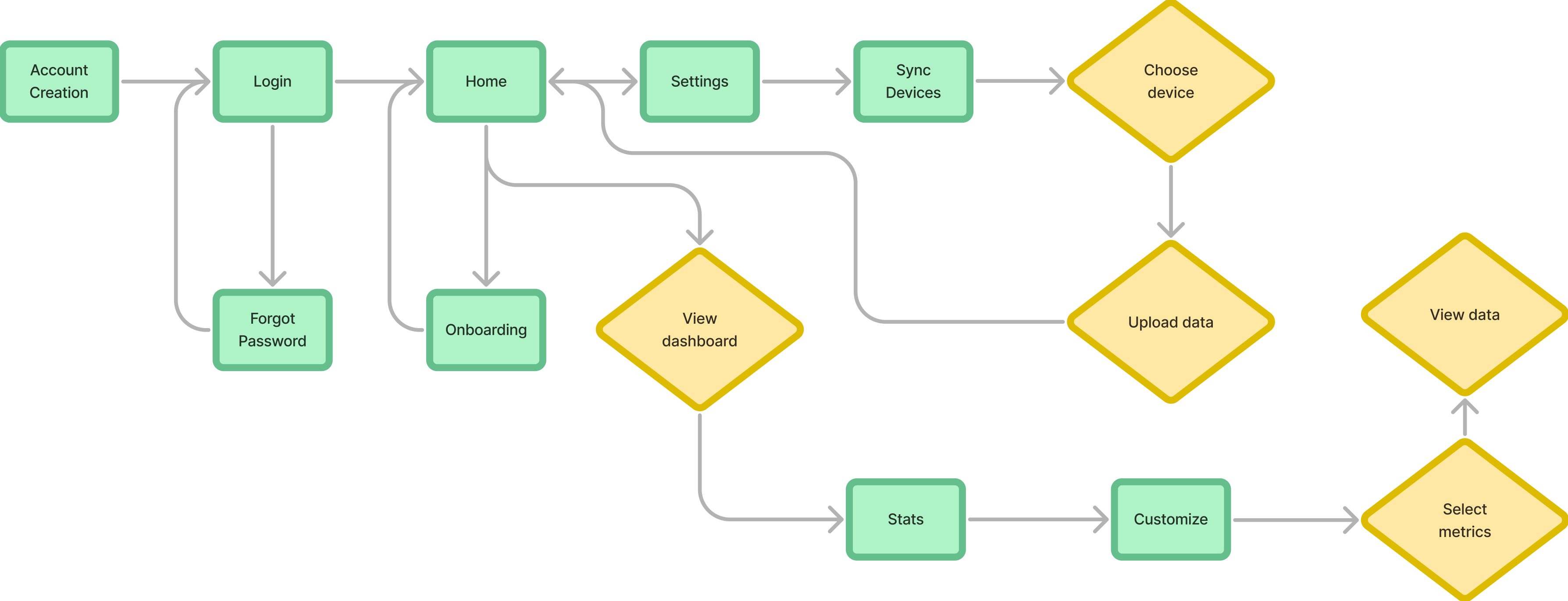
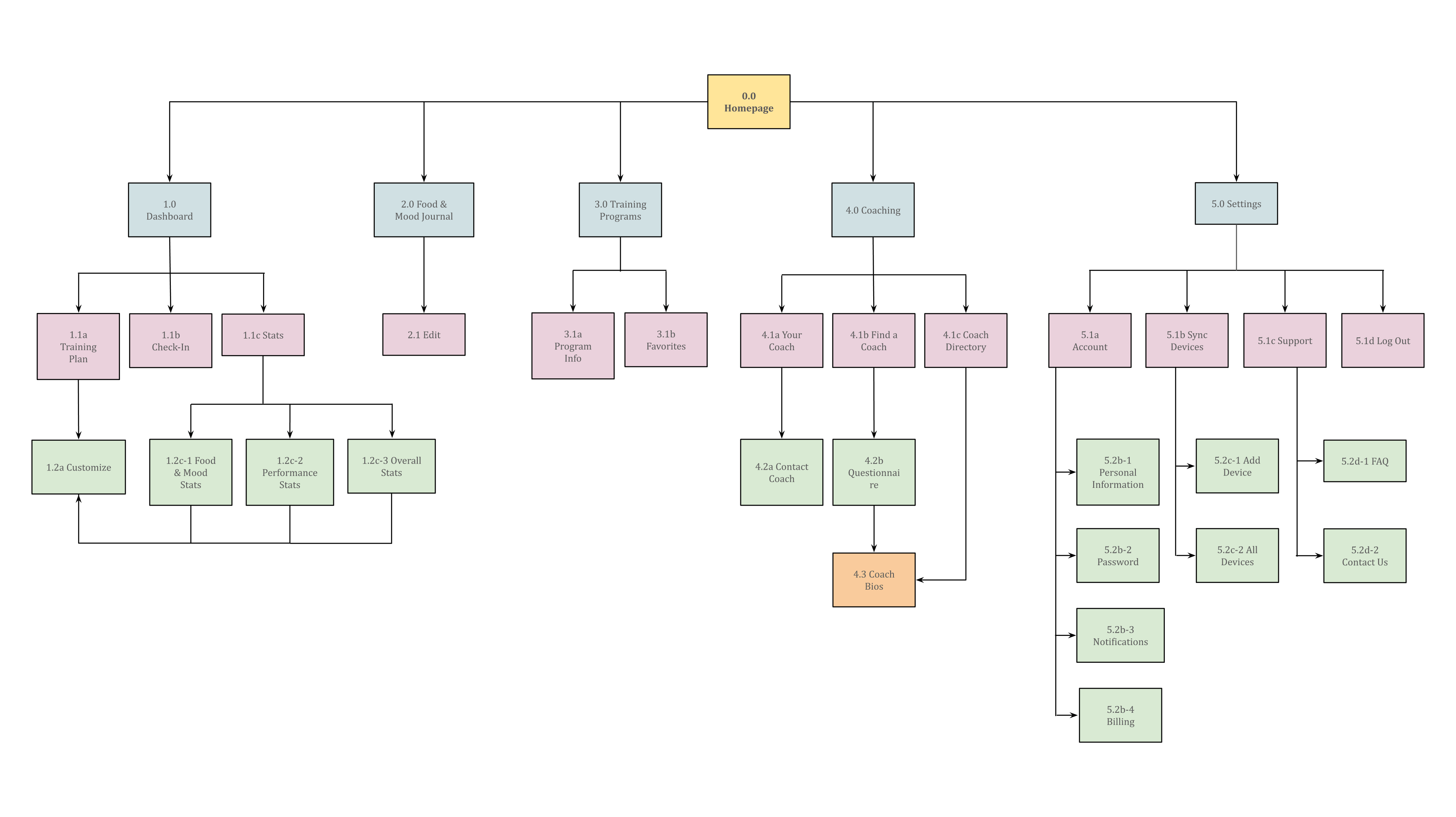
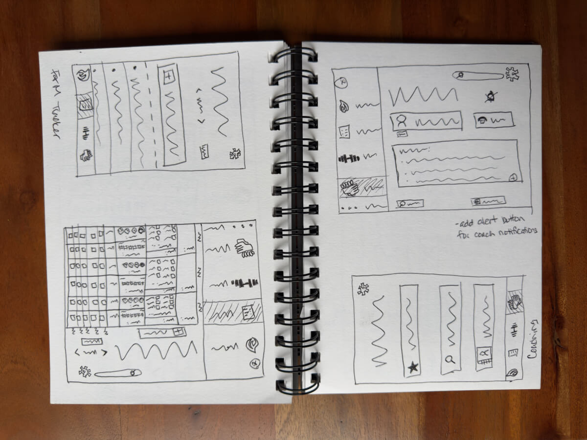
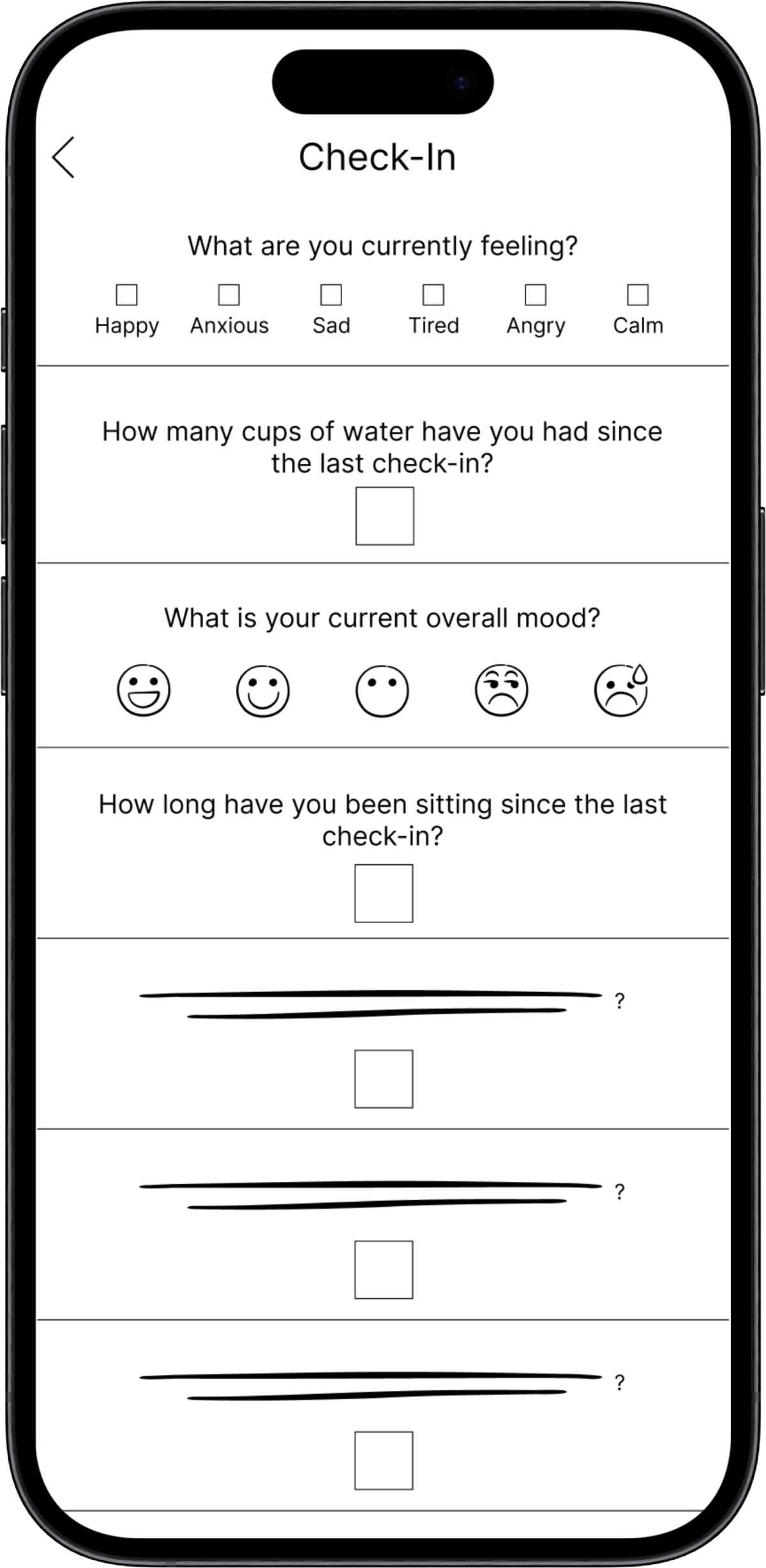
To design the layout of the app, I created user flows based on
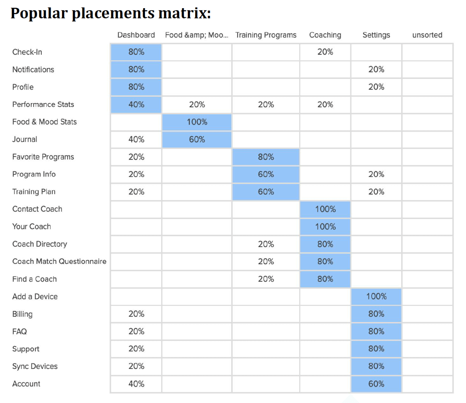
my personas to come up with a sitemap. A card sorting test was
conducted to determine what needed clarification or revision.
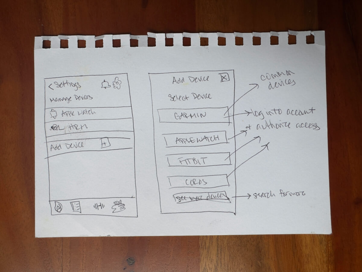
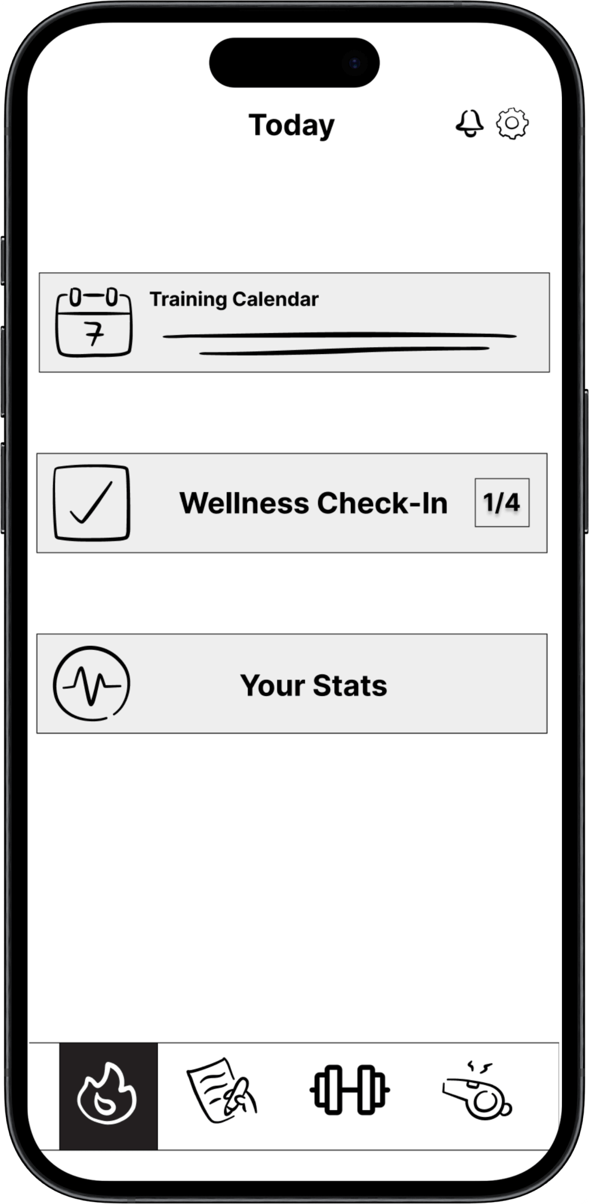
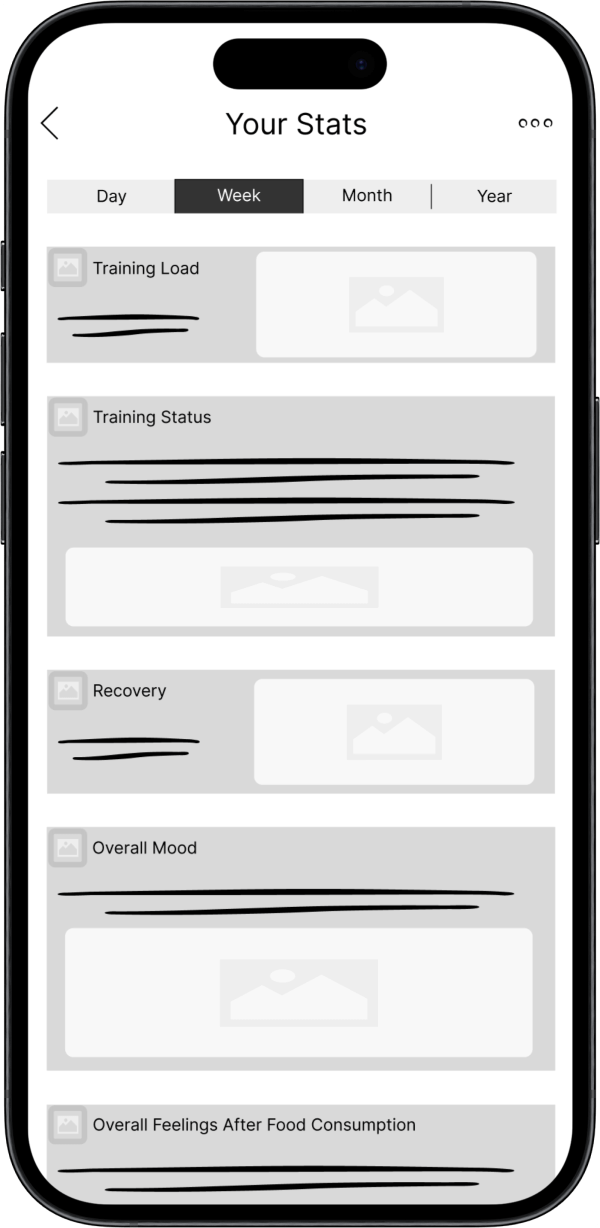
After a final amendment of the sitemap, I created low-fidelity
wireframes of the dashboard and core features.
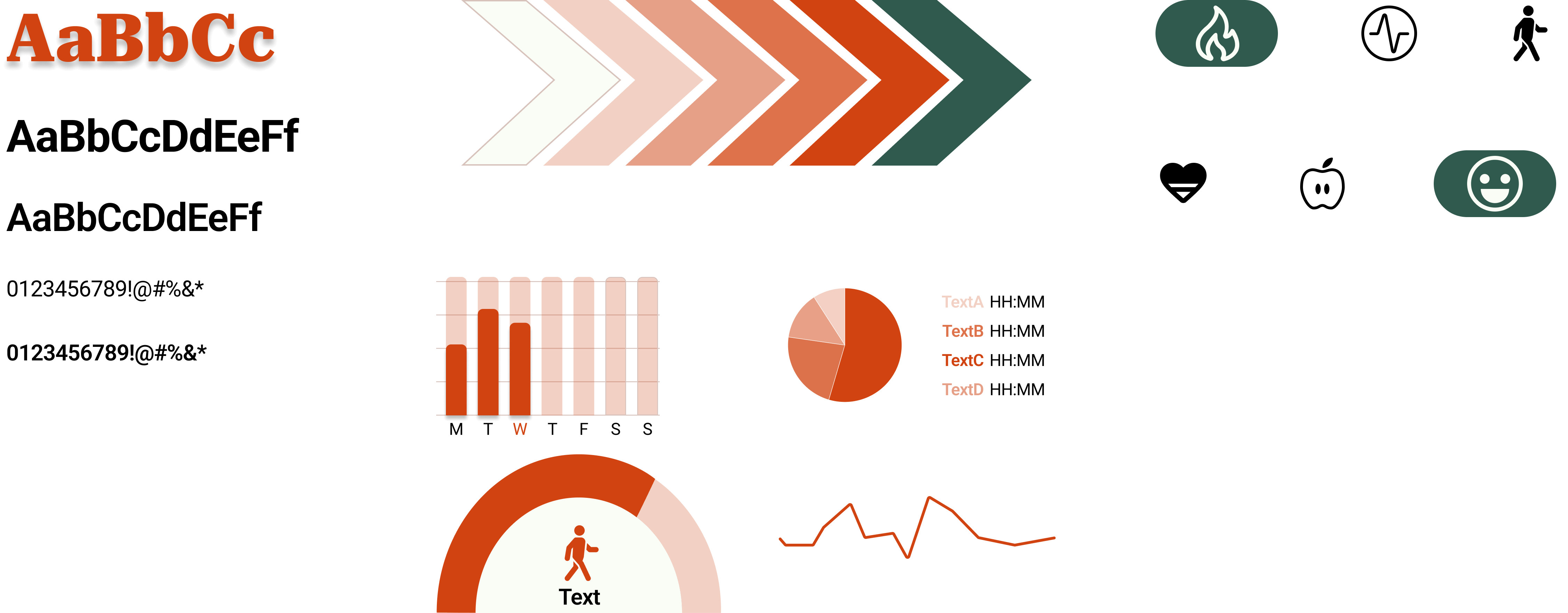
To establish the app's basic foundations, components, and
patterns, I created a design system and style guide to deliver
to developers. To convey emotion within the user, I utilized
hues of orange (excitement and enthusiasm) and green
(tranquility and health) as my primary and secondary colors.
Next Steps
Through a user-centered design process, I gained a deeper
understanding of how to create a solution that not only met the
requirements of a functional application, but also how to make a
meaningful and impactful experience for users.
Going forward, future iterations will integrate additional core
features, such as interacting with a personal coach and a
comprehensive journal for food and mood tracking. Ensuring that
all new and revised designs remain user-centric will drive an
effective and enhanced solution within the health and wellness
industry.

